VENMO
ADDING A NEW FINANCE FEATURE
OVERVIEW
Venmo is a mobile payment service that allows people to quickly send each other money through their app. Venmo has emerged as one of the most popular apps for electronically transferring funds from one party to another.
THE CHALLENGE
Although the current mobile app is very well-rated, Venmo sees an opportunity to expand their personal finance management capabilities. Venmo would like to increase their offerings by providing users with personalized features that allow them to manage their personal finances.
THE OUTCOME
A cohesive added new feature, My Finance within the app that allows users to manage their personal finances
LENGTH OF PROJECT
80 hours
ROLE
Lead UX + UI Designer
LIVE PROJECT
PHASE 1
RESEARCH
I began the process with doing some market research to gain a better understanding of Venmo and the industry as well as its user demographics. This was followed by identifying competitors, conducting user interviews and doing a heuristic audit to better understand Venmo and its functionality and flow.
MARKET RESEARCH
By conducting market research, I was able to identify peer-to-peer payment market trends and pain points while gaining a better picture of P2P payment mobile app users.


COMPETITIVE ANALYSIS
By observing Venmo’s direct and indirect competitors, I was able to observe how other products approach a similar problem. Choosing a handful of the more popular payment service apps, it was interesting to see how they matched up by identifying their strengths and weaknesses. I was able to evaluate how Venmo could have an edge in the market.

PROVISIONAL PERSONAS
In order to frame my mindset to design for the user, I created provisional personas based on market research. They would be validated or invalidated with findings from my user interviews.

HEURISTIC EVALUATION
To familiarize myself with the current design and interface of Venmo, I conducted an app audit. This gave me a better understanding of the main features and interface currently offered. I conducted the audit based on
Jakob Nielsen's Usability Heuristics. Additionally, this helped me
apply the heuristics to my own design of the new feature for Venmo.
.jpg)
USER INTERVIEWS
I conducted several user interviews in order to collect information about their overall experience with Venmo and how they manage their personal finances. Of the interviewees, 4 were male and 2 were female. All the interviewees fall between the ages of 18 - 45. Through these interviews I was able to learn more about who the users are and the experiences they have using the Venmo app.
EMPATHY MAP
I created an empathy map to synthesize my findings from user interviews and observe patterns. Doing this helped me uncover insights and define user needs.
.jpg)


PERSONA
Next, I created a user persona to define a target audience I would design for based on the findings from the empathy map. Kaylene Davis represents Venmo's target demographic. With Kaylene, we can better empathize with the target user throughout the design process.

PHASE 2
DEFINE
I created POV statements to frame the problem from the user's perspective and HMW questions to approach the problem in different ways, guide my design and spark brainstorming ideas. Furthermore, I reflected on the business and user goals to find a happy medium for all stakeholders. Once I had identified common goals, I listed product features that were necessary for the prototype.
POV STATEMENTS + HMW QUESTIONS
I created POV statements to define actionable problem statements from the user’s perspective. Then, I asked HMW questions to spark ideation sessions that helped me generate possible solutions to the correct challenges.

INDIVIDUAL BRAINSTORMING
Based on HMW questions, I constructed a mind map to provide ideas that can provide solution to our problem. This helped me plan out how to approach each problem.


GROUP BRAINSTORMING
In order to generate even more possible solutions and gain different perspectives, I facilitated an online group brainstorming session by giving 5 participants 3 minutes each to come up with ideas for each HMW question. Additionally, another 3 minutes were given to allow each participants to iterate on other participant's ideas. After, we came together as a group to discuss these ideas.

PROJECT GOALS
Then, I created a Venn diagram to outline Venmo’s business and user goals and observe the shared goals among them. This reminded me to add value to the business with my designs while advocating for the user by providing the best user experience possible.
.jpg)
PRODUCT ROADMAP
Next we complement the project goals with a product roadmap, a list of features based on user research, each given a priority level.
To view the full Product Roadmap, click
here.
PHASE 3
IDEATE
Here I started laying out the foundation and organization for the new website. I followed this up with a site map as well as a user flow and task flow to show how a user might navigate through the new added finance feature.
SITE MAP
To start planning out Venmo’s information architecture with the added feature, I created a sitemap to observe the structure of Venmo, its hierarchy, and the relationship between its screens. This helped me ensure that the flows between the screens would still feel intuitive to users, even with a new feature.
.png)
TASK FLOW
In order to observe the main actions users would carry out on Venmo with the new feature, I created a task flow. This helped me highlight key screens to design.

USER FLOW
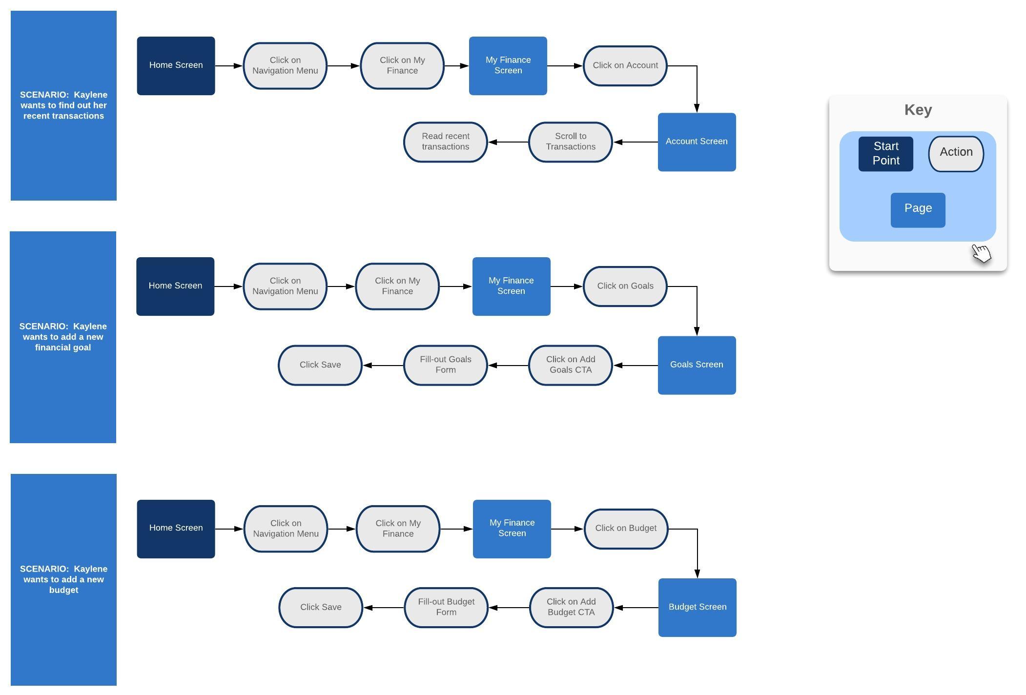
To understand the various ways users can interact with Venmo’s new feature, I created a user flow portraying my user persona, Kaylene, in different scenarios. This allowed me to observe different pathways users can take on Venmo depending on the decisions they make. Again, this helped me highlight key screens to design for users to meet their goals.

UI REQUIREMENTS
As I created the the task and user flows, I created a UI requirements document to
ensure that I would meet all the high-level and detailed requirements for each screen that I designed.
Read UI Requirements document here.PHASE 4
DESIGN
In order to conceptualize how these new features will fit within Venmo's current design, I began the process with sketching out different ideas. I then proceeded to add more context to these sketches by incorporating Venmo's branding and UI through a high-fidelity wireframe.
LOW-FIDELITY WIREFRAME SKETCHES
By referring to my sitemap and UI requirements document, I created low-fidelity wireframe sketches to start planning the screens I would design efficiently. I was able to observe the structure, hierarchy, and layout of each screen before adding any content.


HIGH-FIDELITY WIREFRAMES
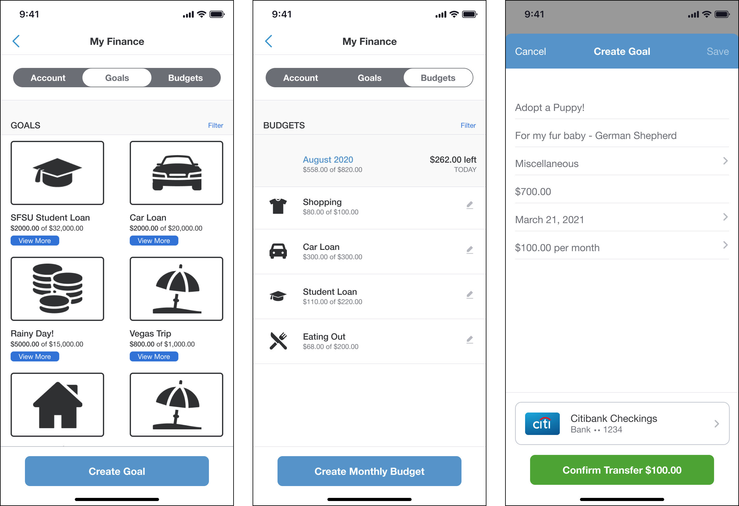
My designs came to life in the high-fidelity wireframes. I designed Venmo’s existing screens by using screenshots from my phone. I made sure to follow Venmo brand guidelines as I added the new finance feature to Venmo to ensure that the new feature would not disrupt the current user experience.


PHASE 5
PROTOTYPE
During the prototyping phase, I created a working prototype in Figma using the high-fidelity screens. This is the prototype I had participants test, going through a few different user tasks.
HIGH-FIDELITY PROTOTYPE
With my high-fidelity wireframes ready, I created a functional prototype in Figma in order to prepare for usability testing. This prototype would allow me to
observe how users interact with my designs before the new feature is launched.
VIEW HIGH-FIDELITY PROTOTYPEUSABILITY TESTING
I conducted usability testing with 5 participants in total, 2 males and 3 females, ranging from ages 18 to 45. The moderated in-person think aloud usability tests lasted approximately 12 minutes each. I informed all participants that we would test a new feature on Venmo’s mobile app. I gave them 4 tasks to complete on Venmo’s prototype, and asked them to walk me through what they were doing out loud. As users carried out these tasks, I documented their actions, comments, and questions. Usability testing allowed me to uncover user pain points and make improvements to Venmo’s new feature.
i. TEST OBJECTIVES
• Observe how users navigate through the Venmo with new finance feature
• Observe how users can efficiently complete given tasks
• Identify any frustrations, difficulty etc. from the user
• Observe how long it takes for users to complete each task
II. TASKS
• Find Venmo’s new feature, My Finance
• Find your recent account transaction at Roscoe’s
• Create a new goal by adding “Adopt a Puppy!”
• Create a new monthly budget for groceries for the month of September.
PHASE 6
ITERATE
Taking the results and findings from the affinity map, I was able to come up with a few recommendations for improvement on the website. I applied these recommendations and further developed the prototype as well as the branding assets.
AFFINITY MAP
I synthesized my findings from usability testing in an affinity map to observe patterns, pull insights, and identify recommendations in order to make improvements to Venmo’s new feature.
.jpg)
BRANDING
To ensure that I would
follow Venmo’s brand guidelines in order to integrate the new finance feature into the mobile app seamlessly, I first created a
mood board with Venmo’s brand elements, UI, and logo. Then, I created a style tile and UI kit to ensure that
I used elements that aligned with Venmo’s brand.

HIGH-FIDELITY WIREFRAMES + PROTOTYPE
With the feedback from usability testing, I made improvements to my high-fidelity prototype to
improve the overall user experience of Venmo’s new feature.
VIEW HIGH-FIDELITY PROTOTYPEUI KIT
This document keeps all of the UI elements and patterns in one place for easy reference.

CONCLUSION
In the end, this project definitely presented a challenge for me, most of all staying within existing design patterns for Venmo. I believe this represented real world projects compared to what I have had to do before with previous projects for clients. Venmo has a large and dedicated user base and has already established its core features. Once I was able to identify and gain insight from target users, opportunities arose for areas of improvement. These new features presented would need to be further tested to fully determine if they are a benefit for current users.
NEXT STEPS
• Discuss challenges with developers and engineers of new features
• Continue with user testing perhaps with a small group of target users to determine engagement of new features


.jpg)
.jpg)


.jpg)
.png)


.jpg)

