MIRROR
WEBSITE DESIGN + REBRANDING
OVERVIEW
A successful, 26 year old clothing store company that has 400 brick-and-mortar stores in 32 countries. It is a global chain that offers variety of clothing for everyone at affordable prices. They came to us with the task of rebranding to a more modern feel and taking their product online with a responsive e-commerce website.
THE CHALLENGE
Consumers are buying more online, and Mirror wants to create an effortless and transparent experience for its customers. The challenge would be to create a responsive website that embodies and enhances the current in-store experience.
THE OUTCOME
A usable and aesthetically appealing online platform with strong brand identity.
LENGTH OF PROJECT
4 weeks
ROLE
Lead UX Designer
LIVE PROJECT
PHASE 1
RESEARCH
During the research phase, I want to understand the current state of the e-commerce retail landscape. My intention for the research phase was to uncover the needs and frustrations of the target user to better understand how to appeal to them. I researched the online clothing industry, looked at direct and indirect competitors within the space and conducted user interviews.
MARKET RESEARCH
With market research, I was able to get a better understanding of the online shopping industry. This includes demographics, buying behavior, trends and concerns.

COMPETITIVE ANALYSIS
With the online clothing industry being such a large market, it is critical to understand both direct and indirect competitors. This will help Mirror set themselves apart from their competition.

USER INTERVIEWS
I conducted several user interviews in order to collect information about their online and in-store shopping experience. Of the interviewees, 3 were female and 2 were male. All the interviewees fall between the ages of 25 and 55. We were able to gather qualitative data and evaluate patterns.
EMPATHY MAP
After conducting interviews, I took those findings and organized them with an empathy map. This allowed me to clearly see user needs and common patterns.


PERSONA
In order to define the target user and cultivate empathy, I first constructed an empathy map based on the interviews performed. From here, I was able to see the users' needs and common patterns. Next, I used all of the qualitative data I gathered during the research process to create Casey Wiser, my user persona. Casey is a 30 year old health care worker looking for quality clothes at an affordable price.
.jpg)
PHASE 2
DEFINE
I reflected on the business goals, user goals, and technical considerations to find a happy medium for all stakeholders. Once I had identified common goals, I listed product features that were necessary for the prototype.
PROJECT GOALS
Now that I had empathized with target users and identified their needs, I needed to define the solution by finding common goals based on the business, user and technical goals.
.jpg)
PRODUCT ROADMAP
Next we complement the project goals with a product roadmap, a list of features based on user research, each given a priority level.
To view the full Product Roadmap, click
here.
PHASE 3
IDEATE
Through the activity of having several participants perform an open card sort, I was able to gather information to further understand the users' organization techniques. From here, I was able to apply those findings to generate a sitemap as well as both task and user flows.
CARD SORTING
In order to understand the users' expectations and evaluate how to build the information architecture of the website, I conducted card sorting activity. Optimal Workshop was used as the main platform to run the remote card sort and validate results. Seven participants (4 female and 3 male) were asked to take part in the Open Card Sorting with no time limit.
.jpg)
I. FINDINGS
• Participants created a total of 53 categories, with a median of 9 categories each.
• Participants categorized items based on use and features of the product.
• Cards that do not correspond as a product use or feature were grouped together as naming convention for special items. These included “Sale,” “Collection,” and “New Arrivals.”
SITE MAP
By using my feature roadmap and card sorting study findings, I created a sitemap to plan the structure and organization of Mirror’s website. This allowed me to observe relationships between Mirror’s main pages and ensure that the flows within the website would feel natural to users and meet their needs.

TASK FLOW
To better understand how users will navigate through the site to search a product and make a purchase, I produced a task flow. This allowed me to think through different scenarios and make sure all possible pages are developed to help the user complete a purchase.
.png)
USER FLOW
Then, I created a user flow to display the different pathways a user could take to achieve various tasks in three different scenarios. Creating this user flow helped me plan out the screens users would need in order to meet their goals.

PHASE 4
DESIGN
I began the process with sketching out different versions of the home page based on the user feedback from previous activities. I then proceeded to add more context to these sketches through mid-fidelity wireframes. I also established the new look for the brand by designing the new logo and branding guidelines for Mirror.
LOW-FIDELITY WIREFRAME SKETCHES
After establishing Mirror’s information architecture, I sketched out three homepage wireframes by referring to my feature roadmap, my sitemap, and competitor websites. This was an efficient way to experiment with the layout of Mirror’s homepage and organization of different features before committing to designing the UI digitally.
.jpg)
MID-FIDELITY WIREFRAMES
I created mid-fidelity wireframes for Mirror’s homepage, category page, and product details page to visualize the layout, structure, and hierarchy of these pages before adding actual content. These wireframes also helped me plan out the organization of features that meet users’ needs.


RESPONSIVE WIREFRAMES
I created responsive wireframes for Mirror’s homepage to adapt to different screen sizes, including desktop, tablet, and mobile devices. This ensures that the different screen sizes retain consistency and provide a better user experience.


PHASE 5
PROTOTYPE
During the prototyping phase, I brought the mid-fidelity wireframes I created in Figma to create a prototype. This is what I had participants test, going through a few different user tasks.
BRANDING
To ensure that Mirror’s website successfully represents its brand, I first defined Mirror’s brand attributes: Modern, Fresh, Growth and Successful. Then, I created a
Pinterest mood board with visual elements that aligned with these attributes. The mood board helped
guide me toward a design direction to retain consistency and represent Mirror’s brand. I also used Mirror’s brand attributes as a guide to create its logo.
.jpg)
HIGH-FIDELITY WIREFRAMES
With Mirror’s branding established, I designed high-fidelity mockups of Mirror’s homepage, category page, and product details page. Then, I created a prototype using Figma to allow participants to interact with a functional prototype during usability testing.
.jpg)


.jpg)
USABILITY TESTING
I conducted usability testing with 8 participants in total, 6 females and 2 males, ranging from ages 25 to 55. The moderated in-person think aloud usability tests lasted approximately 15 minutes each. I introduced Mirror as an e-commerce clothing website to all participants, gave them 3 tasks to complete on Mirror’s prototype, and asked them to walk me through what they were doing out loud. As users carried out these tasks, I documented their actions, comments, and questions. I asked clarifying questions throughout the sessions when necessary. With the information and feedback from usability testing, I was able to improve Mirror’s website.
i. TEST OBJECTIVES
• Test for ease of navigation based on flow and design of site
• Test how users prefer to search for products and if they are able to complete tasks without difficulty
• Observe any frustrations, difficulty etc. from the user
II. TASKS
• Find a pair of women’s skinny jeans that is priced at $87.00, in color white, and size 27
• Add the skinny jeans to your cart
• Purchase the jeans you placed in your cart as a guest
PHASE 6
ITERATE
Taking the results and findings from the affinity map, I was able to come up with a few recommendations for improvement on the website. I applied these recommendations and further developed the prototype as well as the UI Kit.
AFFINITY MAP
I synthesized my findings from usability testing in an affinity map to observe patterns and pull insights and recommendations. From these findings, I specified improvements I needed to make to Mirror’s website.

HIGH-FIDELITY PROTOTYPE
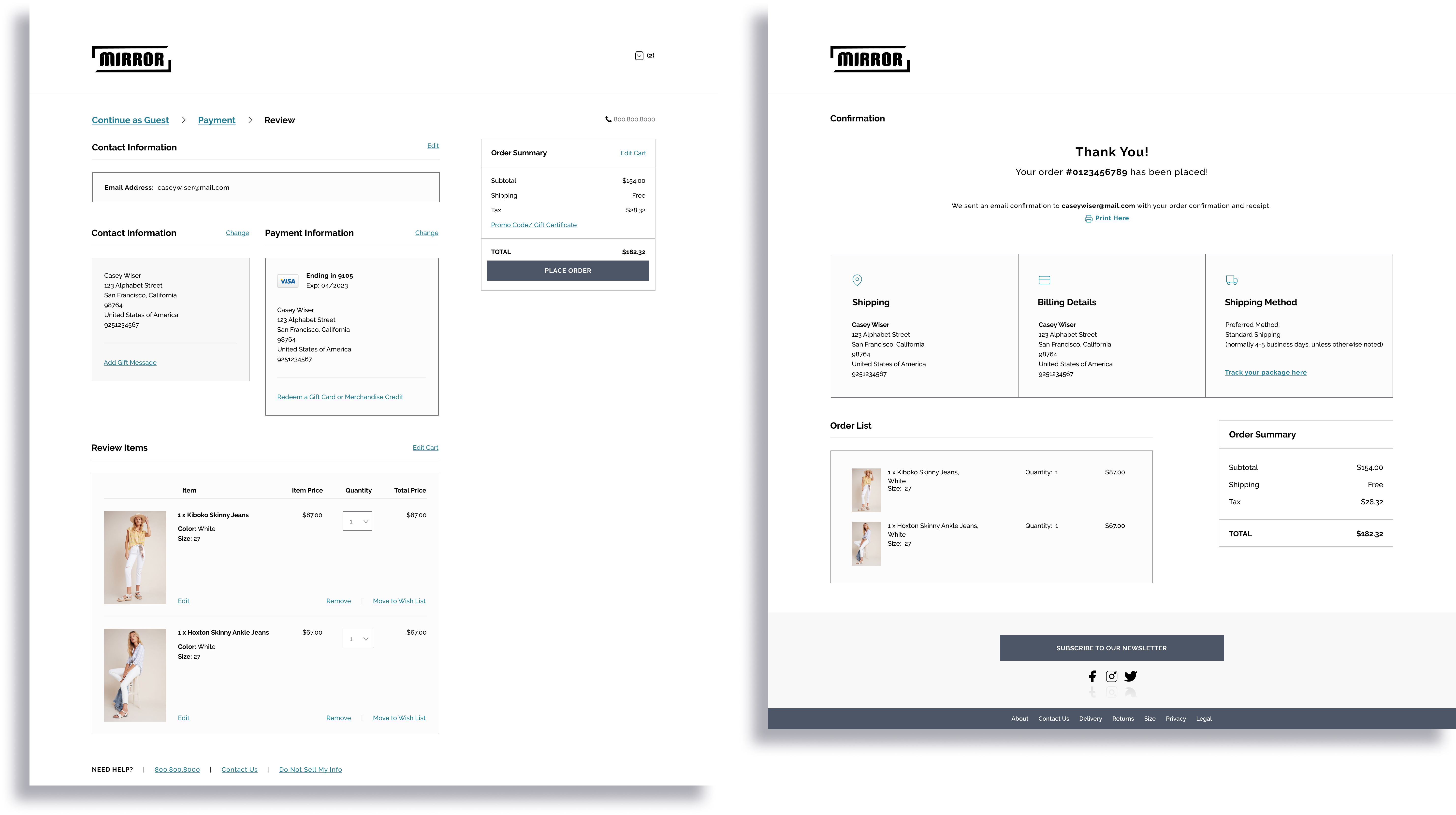
Finally, I applied the branding and styling to the wireframes and made an updated prototype using Figma. The new prototype shows the updated look and feel.
VIEW HIGH-FIDELITY PROTOTYPECONCLUSION
I learned a great deal about the online clothing industry - both design patterns and the users related to the market. Performing the different research techniques has made me realize how effective and necessary it is to establish every project on hard facts. If I can understand the industry and the target market I am designing for, the more effective the end product will be.
NEXT STEPS
• Continue organizing and improving the design deliverables
• Continue conducting user testing of the prototype to discover more areas of improvement
• Work with developers to implement the design and features of the website


.jpg)
.jpg)
.jpg)

.png)

.jpg)


.jpg)
.jpg)


.jpg)
